Government information and services can be difficult for the average user to make sense of, even in the best of times. As we face COVID-19 and wildfires, the need to make sure Californians have the information and access to services that they need is more critical than ever - and more challenging.
COVID-19 has brought new policies and corresponding guidance for everything from manufacturing and eating out, to getting rent and food assistance, and even just going to the grocery store. The sheer volume of essential information people need can be overwhelming.
To provide a single, one-stop shop to answer COVID questions, our team was directed to build covid19.ca.gov. We built it in just four days, guided by our core principles. Foremost among them: put the user first, make it accessible, make it fast, and make it simple.
Since we launched in March, we’ve been testing, iterating, and improving, doing the hard work of making information that’s complex, complicated, and often confusing into something simple, accessible, and helpful.
We’ve added new team members who bring deep expertise in UX design, content design, user research, and product delivery. We’ve established effective two-way communication with subject matter experts and policy makers to ensure the non-stop stream of data and information is accessible. And we continue to ask users what they think, incorporating their feedback into the product in real time.
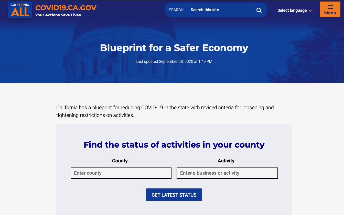
Recently, the governor introduced the “Blueprint for a Safer Economy,” a new framework for reducing the spread of COVID-19. Central to the framework are criteria for loosening and tightening restrictions on everyday activities, like getting a haircut or going to the mall. To help make this framework accessible and usable by Californians, we designed and developed a new tool that shows simply and clearly what's open and what’s closed, county-by-county.
Our goals with this iteration were threefold:
- Serve as the single source of truth on open/closed status and restrictions around any particular activity in every county
- Reduce confusion on what is safe and why/why not, when this will change and why
- Give individuals and businesses the information they need to be able to plan ahead and flex as needed
In addition to the open/closed tool, we redesigned our homepage and basic elements of the site, like the footer, the font, colors, header, and navigation.
We've learned over the last few months that something as simple as a word change on the website can represent the state’s governing response to the pandemic. And that delivering simple, fast, accessible information in the midst of multiple, simultaneous crises means coordinating in real time with everyone involved in the process: legal, subject matter experts, stakeholders, etc. Which in the midst of a crisis is not always easy.
It also means almost constant iteration of design, development, user research, product management and content. Importantly, it requires balancing the reality of regular fire drills and high-level and often complex policy and legal guidance with the need to prioritize and maintain the user experience.
What you see is a work in progress. And, as always, we need and value your feedback.
Applying analytics and research to simplify the complicated
We started work on the new, status-lookup tool by listening to what our users were saying and doing.
In a nutshell: people want to know what they can and can’t do so they can plan, and live their lives, safely.
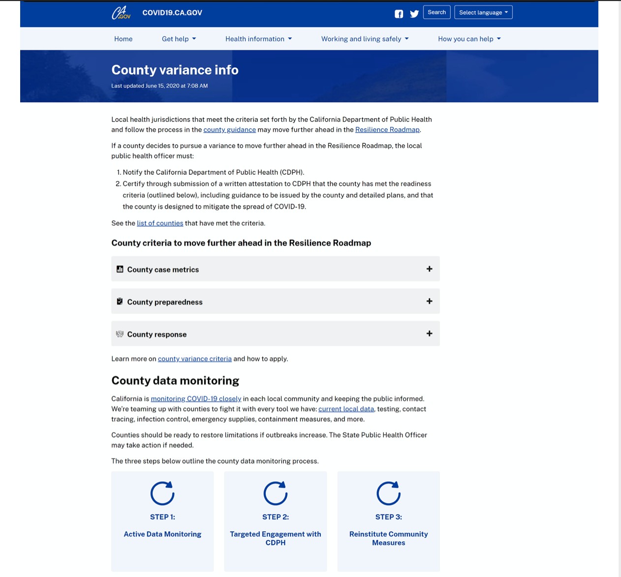
Our site analytics clearly showed that most users were navigating to just two pages when they landed on the site: “County variance info,” where county-specific information is available and the Stay Home Q & A, which is designed to answer questions about essential and non-essential needs and activities.
This was further evidenced in our user testing and survey feedback.
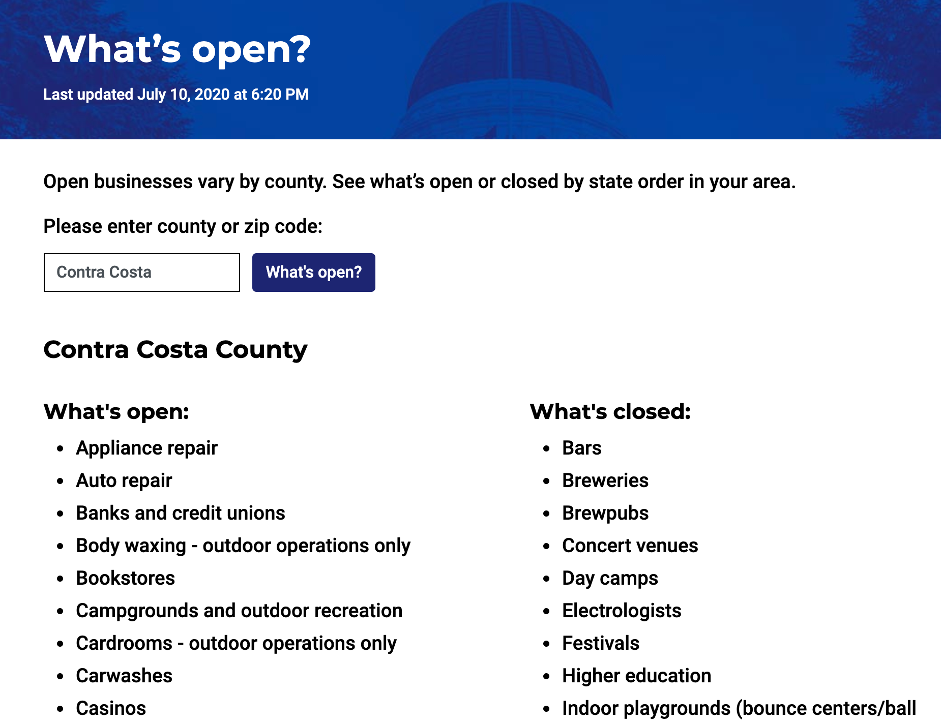
We conducted 20 user testing sessions. Throughout, the question of what’s open or closed in their county came up repeatedly. Users loved the idea of being able to use their zip code to get answers and repeatedly expressed confusion about the multiple previous frameworks like the monitoring list (“I am not sure what that is").
The feedback was unambiguous: users wanted an easier, more straightforward way to find out what’s open, what’s closed, in their county. And businesses want simple, clear guidance about whether they can open and how.
A simple tool for a complex time
One of the key innovations in the blueprint is simplifying the previous frameworks by collapsing them into an intuitive four-tiered system. This is at the heart of this newest covid19.ca.gov product iteration.
Beginning as early as May, we started to think about simple ways to address one of our users’ top question: What’s open?
Our team built an initial prototype, that we dubbed “project alameda haircut,” named to reflect user feedback, and in particular a user in Alameda who asked us about whether and when they can get a haircut.
As we iterated the product, policy makers were also iterating. Together, we were putting into practice the principles of delivery driven government articulated by Code for America, namely: 1) understand and meet user needs; 2) real-time user data, not years-old estimates; and 3) iteration, from intention through implementation.
The new tool developed to support the Blueprint for a Safer Economy framework was informed by lessons learned and is an iteration of “project alameda haircut.” It’s simple and intuitive to use, and validated by users. The user simply enters their county and desired activity to find out if it’s allowed or if there are any restrictions. What started out as a list of links and PDFs has evolved into a more interactive tool informed by data, user feedback, policy, and design.
Moving forward, continuing to iterate
In the near term, our focus is to continue to bring data and data-driven tools into the site by making the user experience more meaningful and easier to understand. And as always, speed, accessibility, and readability remain at the core of our work.
As we continue to iterate on this redesign and new tool, we will keep these principles central to our work of making the complex and complicated more easily understood and quickly accessed for every Californian.